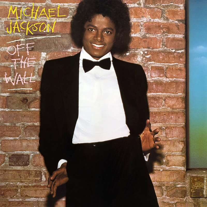
 Artist: Michael Jackson Album: Off the Wall Year: 1979 Cover Art Direction: Mike Salisbury Cover Photo: Steve Harvey Hot on the heels of his success with The Jacksons, Michael Jackson was ready to debut his first solo outing as an adult entertainer in the summer of 1979. Taking his career trajectory to stratospheric heights, that album, ofcourse, became Off the Wall. The album’s title was conceived by none other than Rod Temperton, who penned the title track. For the album cover, Michael initially went to photographer Jim McCrary. The idea was to capture the excitement and energy of a rising superstar. None of the photos taken that day were considered, however, as Michael didn’t quite like the way they came out. 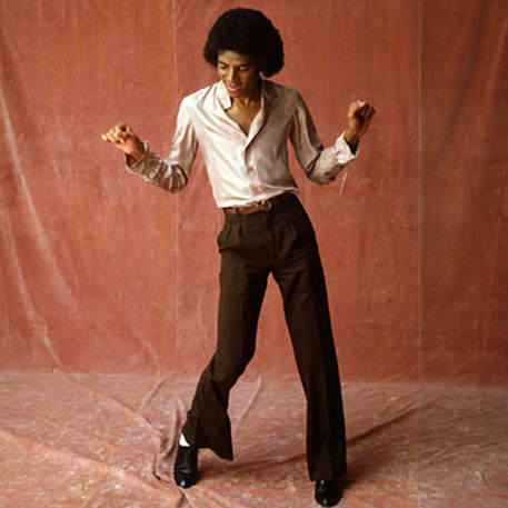 Figure 1 McCrary, Jim. Michael Jackson. 1979 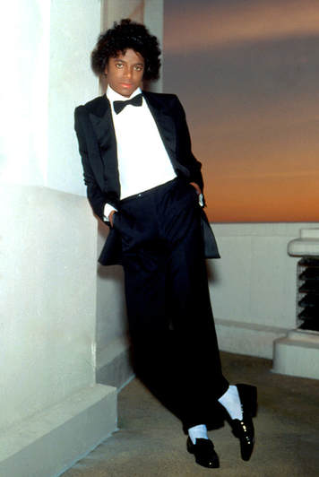 Figure 2 Salisbury, Mike. Michael Jackson. 1979 Figure 2 Salisbury, Mike. Michael Jackson. 1979 In the end, Michael Jackson turned to famed photographer Mike Salisbury for inspiration. The two got together for a photo session and the rest was history. The album was released on August 10, 1979 and the cover art adorning its frontispiece reflected both the youthfulness and maturity of a then-21-year-old Michael Jackson. Below is a transcript of an interview Mike Salisbury did shortly after Michael’s passing, on the eve of the album’s 30th anniversary, in which he reflects on the inspiration for the legendary album cover and the process of bringing it to life. Legendary Branding: Mike Salisbury The look Michael and I created together at the time was a graphic metaphor of his coming of age, of his stepping out as a man on his own. Those images, the black and white palette, the socks and glove, and all the other trademark elements we came up with, were kept in some form as the symbol of Michael Jackson throughout his career. His branding. Michel always used the look we created for Off the Wall as a logo. A brand icon. Until The Wiz, I had only thought of Michael as the kid from The Jacksons and The Jackson 5. In The Wiz, he was grown man and a person in his own right. He out-danced, out-sang, and out-performed the rest of the cast, and with a personality bigger than the screen. Suddenly I was struck by lightning – I knew the look for Michael. I begged his agent to let me create the cover for Off the Wall! At the time, young Michael was a gangly kid with an Afro. Literally a kid. But I wanted to put that kid in a tuxedo – a tuxedo and white dress shirt, looking like Sinatra walking into the spotlight to the applause of a sold-out Vegas performance. I was not only designing and creating a cover; I was branding a person. We tried several times to get the shots for the cover. After a shoot at the Griffith Park Observatory under the Hollywood sign that didn’t work for me, we tried a re-shoot in photographer Steve Harvey’s Hollywood studio. Nothing was happening. The photograph in the theatrical tuxedo, with the Gene Kelly white socks and loafers, needed something more than just a white background. I needed a background to support the metaphorical symbolism of the tuxedo and the young kid with the big talent. In an urban alley against an old wall of real brick, I directed Michael to be more animated in his pose. And I told him to smile. Voila! Off the Wall. Perhaps after the Great Wall and the Berlin Wall, one of the most famous walls in the world. A wall I picked to be our backstage, the alley door of a Broadway theater. I added the white glow to the socks for emphasis before the album cover was printed. Those, along with the black tuxedo pant cuffs and the black penny loafers, are the most iconic parts of the brand image, and when the album was reduced to CD size, that was the most indelible visual, particularly in that smaller size. The printing of the original cover sucked. The glow of the white socks was not handled to be as soft and cloudlike as I intended. Michael’s likeness suffered. Worse, I was never asked to proof the printing! And until an interview I did after Michael’s passing, one focused on my involvement in creating his look and the cover of Off the Wall, I never understood exactly what I didn’t like about the title lettering. Looking at the CD back cover, there was another – newer – photo of Michael, still in a tux but in front of a faux brick wall. He is holding a pre-school style chalk holder with a big piece of chalk in it as he affected a visibly awkward “Michael Jackson pose.” Kindergarten chalk lettering on the original Off the Wall cover of mine? That’s what bothered me: another denial that Michael Jackson was not a child but a major entertainer. I felt this lettering was as big a mistake as the printing quality of the original cover. The kiddie school chalk was infantile and wrong but what would work? Graffiti? Wrong message at the time. 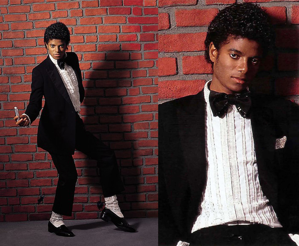 Figure 3 McCrary, Jim. Michael Jackson. 1979 The Man Behind the White Socks: Mike Salisbury Mike, you created the image of Michael Jackson for the cover of his first hugely successful solo album Off the Wall. How did it all happen? Having just seen Michael Jackson in the movie, The Wiz, I was more than blown away. I knew his agent and called him to say that Michael was going to be huge – the biggest – and I wanted to work on something with him. Anything. The agent told me to come to his office immediately. I ran to Beverly Hills. He showed me an album cover mock up. “This is to be his solo debut album. What do you think?” I said that it looked like a cheap ad for the children’s department at Macy’s. “I know,” the agent agreed. “It sucks.” I said, “Michael Jackson is going to be a phenomenal star and must be introduced to the world with an exciting image that would be iconic of him as a star and a star on his own. Let me come back with some ideas.” What was the creative process for you? Marketing recording stars like George Harrison, James Taylor, Ike and Tina, Rickie Lee Jones, and art directing Rolling Stone magazine, I had experience in the music business. And I had an idea to market Michael. But it needed to be sold with a presentation. I did not want to get shot down because my concept couldn’t be visualized if I simply just verbalized it. This was the major turning point in a young artist’s life and I wanted to create for him a new image, a brand. Most music marketing elements – covers, photography, logos – all the elements are usually created in verbal sessions with the artist. But I had one really good idea and had no idea who I would be presenting it to, and if not Michael, I needed something that he would get If it was delivered to him by anyone but me. My concept must tangible. It involved creating not just an album cover – it was a new look for Michael. How did your concept become visually tangible? Because I was not only designing and creating a cover, I was also styling a person so I had my concept sketched in several variations by a fashion illustrator who was not only good at fashion but could also draw an accurate likeness of someone. This had to express the concept and look like our star. Did your presentation work? I returned to the agent’s office and presented the concepts. He looked, looked again, perplexed like a cross eyed-chicken checking out a worm. I knew I had to sell and sell now. “It’s a metaphor,” I probably yelled, “It’s a metaphor!! He’s a kid just out from under his dad, just stepping away from his big brothers. I want it to make a statement: this is his debut as a man and it’s as big as Sinatra coming on stage in Vegas. This is a new emblematic symbol created by combining two symbols not usually associated with each other – a visual metaphor.” What symbols did you combine to create your visual metaphor and just what is the metaphor? At the time, young Michael was gawky and had an Afro. A kid. Pointing to the concept drawing, I said, “I put the kid in a tuxedo – a tuxedo like Sinatra walking into the spotlight to the applause of a sold-out Vegas performance. Black and white. Simple. Dramatic. Something that says: big deal!” The agent hemmed and hawed and was just about to dismiss the whole nutty idea when a little high-pitched voice softly squeaked, “I like it.” And Michael stepped out from behind the tall heavy drape covering the large office window. “Let’s do it.” Where did the white socks that he continued to wear with black pants and shoes his entire career come from? Michael bought my idea with glee but he wanted to make one change: “I want to wear white socks,” Michael whispered. “Then they have to be glamorous socks,” I said. They were custom made for Michael by famous Hollywood costume designer Bob Mackie. My wife at the time found a Yves St. Laurent woman’s tux in Beverly Hills that fit Michael, and when we shot the cover I said, “Roll up your pant legs and put your fingers in your pockets and pull your pants up like Gene Kelly – to show off the socks.” To really pull off the Gene Kelly thing, I had Michael get loafers like Kelly wore with his white socks under rolled up pant legs in the film, “An American in Paris.” 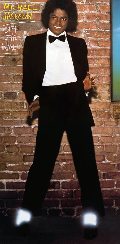 Figure 4 McCrary, Jim. Michael Jackson. 1979 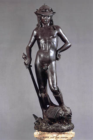 Figure 5 Donatello. David. 1440 Figure 5 Donatello. David. 1440 Well it worked. Not at first. The first shoot for me simply did not work. It had no energy. No literal wall imagery. And, as they say in music – “No announcement value.” Michael was a good sport and we reshot it in an urban alley against an old real wall made of brick and “Voilà!” Off the Wall! Perhaps after the Great Wall and the Berlin Wall – one of the most famous walls in the world. I also added the window and the sky in Michael’s wall. There was just too much brick and it seemed dark. And the window added just a bit of Magritte surrealism. And that first cover had something really special about it. A fan wrote recently and remarked that he liked that particular shot because it captured Michael in his natural state. So yes, it worked. Let’s talk about the glove…it is, after all, the ultimate Michael symbol. Basically, it was just further development of “the look.” The white socks were so successful at drawing attention to Michael and his dance moves, a conversation started about doing gloves too. White gloves. I felt that would start looking literally Mickey Mouse (and of course Michael was a big Mickey Mouse fan), so between the agent and Michael and myself, we got it down to one white glitzy glove. Another great move for attention. There’s all this talk recently about the glove being an attempt to hide his skin condition, but I was there when the look was created and it was all about making a distinct creative statement and getting attention. And it worked! Of course, another iconic element of the look was the hat. I know where the socks, shoes, tux and glove came from but the hat was after my involvement. I had thought that since I turned Michael onto Gene Kelly, perhaps he was the inspiration for the hat (or Sinatra). Then I recalled between cover shoots going to the townhouse Michael had at the time, out in the valley. In the foyer was a replica of Donatello’s David; David wears a hat. Michael liked the look. I also recall the strong graphics of the statue’s body positioning and that influenced me to push Michael further to get to that iconic pose that is the original cover of “Off the Wall.” The whole look we created at the time was a graphic metaphor for Michael’s coming of age, of his stepping out as a man on his own. Those images, the black and white palette, the socks and glove, and all the other trademark elements we came up with, were kept in some form as the symbol of Michael Jackson throughout his career. Progression is seen in his performances of “Billie Jean”: the walls are now dimensional, the jacket glitzier, and the socks twinkle and sparkle. Where exactly was the cover shot taken? The first attempt was at the Hollywood Planetarium, at the Griffith Observatory. Michael drove up the hill, stopped at the spot in front of the building that was the location for the knife fight in Rebel Without a Cause, and that’s where we shot. He was just 21 and came roaring up in a new Rolls Royce. Never really driving himself most of his life, he was a pretty crazy driver and it was smashed up a bit. There was no place to change and we were under the gun because we had no permit to shoot there. But the women’s restroom was open and like a real trouper he ran in there and put on the tux. I didn’t want him to be overpowered in the photo by the building, and he agreed, so we shot closer in to him. Later he was a good enough sport to realize that those observatory shots wouldn’t work and he agreed to a re-shoot. I redid it with photographer Steve Harvey and had Michael stand against the wall. Any concluding thoughts on Michael’s story? There’s a famous Artie Shaw quote. Failure was easy to deal with. You always knew where to go: UP. You would keep on trying. But success was confusing. It was like a drug. Most people are conditioned and used to failure. Not many are conditioned and trained for what happens once you succeed. It’s very, very, confusing..” I think it all just became confusing for Michael. He had so much success and at a very young age. I don’t think too many people can understand what it was like to be him, to continually have to reinvent himself to stay on top. But my visual black and white elements are always there. Just like Michael’s standards. 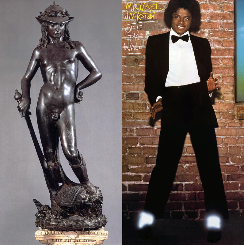 Figure 6 The striking pose of Donatello's "David" inspired Salisbury to try new and creative ways of capturing Michael's dynamism while maintaining his elegance and poise. Donatello’s David Perhaps Donatello’s landmark work – and one of the greatest sculptural works of the early Renaissance – is his 1440 bronze statue of David. Commissioned by Cosimo de’Medici for the Palazzo Medici, it was originally placed on top of a pedestal in the center of the courtyard in the Palazzo Medici, so the viewer would be looking up at it from below. David is shown at a triumphal moment within the biblical storyline of his battle with the Philistine, Goliath. According to the account, after David struck Goliath with the stone from his slingshot, he cut off his head with Goliath’s sword. Here, we see the aftermath of this event as David stands in a contemplative pose with one foot atop his enemy’s severed head. David wears nothing but boots and a shepherd’s hat with laurel leaves on top of it, which may allude to his victory or to his role as a poet and musician. There are so many striking and unique parts to Donatello's David; nearly everything about the statue – from the material from which it was sculpted to the subject's "clothing" – was mold-breaking in some way. Scholars and artists have studied David for centuries in an attempt to both learn more about the man behind it and to more fully discern its meaning. It's clear that there are no accidental compositional elements to David. Donatello's masterpiece is obviously a work that sprang from a crystal-clear vision and months of meticulous construction and fastidious planning. David's pose is graceful and even effeminate; his right hip is thrust slightly outward, his left hand on left hip, in a stance of undeniable femininity. Adding to the feminine overtones is the absurdly oversized sword David is gripping in his left hand, his helmet, and the delicate curves that make up his thighs and torso. His expression suggests purity, youthfulness and innocence with just a hint of enigma and mischief. David's freestanding construction allows the viewer to see it from every possible angle and make note of all the nuances and details so painstakingly applied. At David's feet is the head of the slain giant, Goliath, over which David's left foot is positioned rather languidly, almost carelessly. His left knee is bent demurely to the right in a youthful gesture of diffidence. Livin’ Off the Wall Four singles were released from the album, three of which were accompanied by short films. Michael wrote three of the ten songs on the album himself, including the number one Grammy award-winning lead single, “Don’t Stop 'Til You Get Enough.” Off the Wall became the first solo album in history to generate four Top 10 hits in the US. 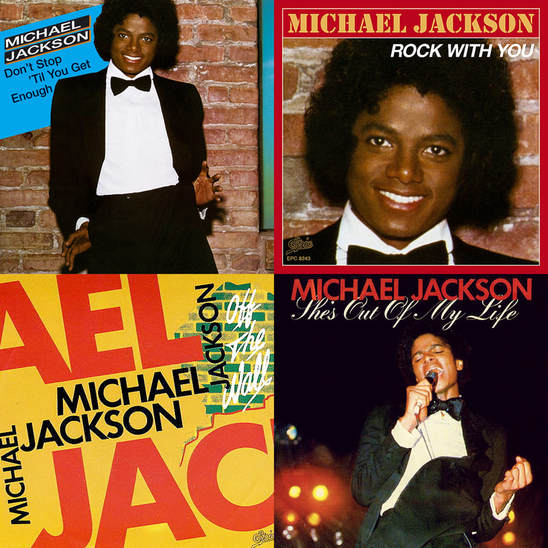 Figure 7 Off the Wall became the first solo album in history to generate four Top 10 hits in the US.
0 Comments
|
AuthorMohammad Osman is an Artist, Writer, & Cultural Historian. ArchivesCategories |
- Home
-
Articles
-
Film
>
- Dark Side of the Screen: The Art of Film Noir
- Gothic Romance: The Art of the Macabre
- Perchance to Dream: The Art of Dark Deco
- The Road Goes Ever On: The Art of Middle-Earth
- There and Back Again: The Visual Poetry of Middle-earth
- King Kong: The Eighth Wonder of the World
- It's Alive: Universal Classic Monsters
- It Came from Beyond: Invasion of the Sci-Fi Films
- Creatures of Habit: Teenage Mutant Ninja Turtles
- Myth and Magic: The Art of Comic Book Films
- Arabian Nights: Sinbad's Adventures
- Music >
- Games >
- History >
-
Film
>
- Artwork
- Community
- About
- Contact
 RSS Feed