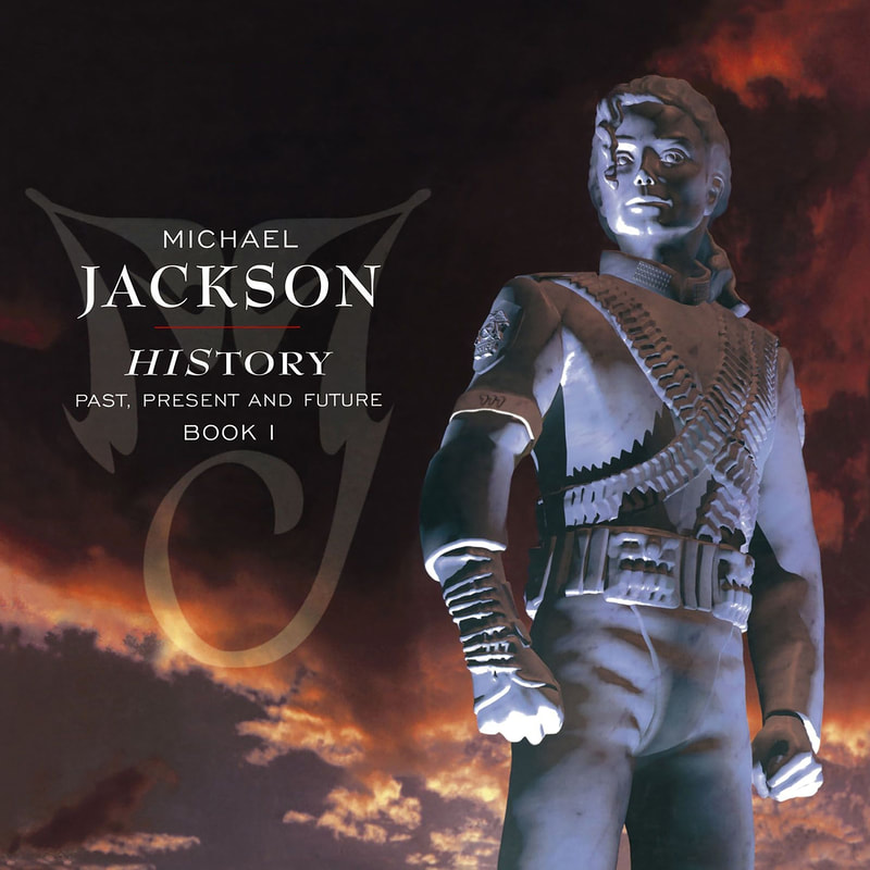
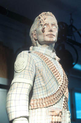
 Artist: Michael Jackson Album: HIStory Year: 1995 Cover Art Direction: Nancy Donald, David Coleman, and Stephen Walker Cover Design: Kleiser-Walczak Construction Co. Sculpture: Diana Walczak Photography: Timothy White In the summer of 1995, Michael Jackson would release HIStory: Past, Present and Future, Book I. The double-disc album featured one disc that collected 15 of his greatest hits, labeled HIStory Begins, and a second disc that included 15 of his brand new songs labeled HIStory Continues. Touted as one of his most autobiographical works, the album covered a wide range of themes from injustice and environmentalism to greed and abandonment. This range extended to the album's penmanship, which included songs written by both Charlie Chaplin and The Beatles. The album even includes memorable guest appearances by The Notorious B.I.G. and Shaquille O’Neal, not to mention the opening track, "Scream," with his sister Janet. As with its predecessor, the final album cover was intended to reflect the artist's state of mind at the time and convey a unique sense of grandeur and mystery. Dan Beck, an executive at Epic Records at the time, shares his thoughts on how the album was conceived and how the fascinating cover art came to be. HIStory in the Making: Dan Beck I’ve reflected a lot over the extraordinary opportunity that I had to know and work with Michael Jackson and to come up with the name for his greatest hits double-album. After marketing the Dangerous album, the idea of a “Greatest Hits” emerged from the record label as the fastest way to generate more revenue from the MJ brand. Record companies are always thinking that way. And while we waited on the ruminations from Michael’s camp on the next album project, I spent about 18 months putting together the Dangerous home video. It was my initial experience, first-hand, of how detailed and big Michael thought. Without Michael, we probably could have finished it in a month and spent $30,000 compiling the contents. As it turned out, we spent about $400,000 and that year-and-a-half clearing orchestral arrangements, finding lost footage and editing and re-editing. All of this came with a great enthusiasm from Michael. He thought through every detail and enjoyed making every element of it. The line producer and I were constantly on the phone, and just elusive steps from calling it a wrap for many months. I reviewed edits and re-cuts every week for months. I went from week to week thinking we would finish by that Friday, only to see many more Fridays come and go. This was, of course, just the warm-up to the Greatest Hits project. The initial plan was for Michael to quickly record a couple of new songs that could be released as singles to drive the sales of a full album of hits. That was somewhat the formula for many Greatest Hits packages by other artists. However, this was Michael Jackson, and his ability to envision almost every  Figure 1 Michael Jackson posing during the Super Bowl Half Time Show in 1993. initiative as “bigger than life”, was his life’s work. The recording went on and on. And three years later, there were three studios and a team of producers and engineers working 24/7 on music for the album. The single album “Greatest Hits” had expanded into a double album; one of new material and the other containing the best of his previous hits. David Glew, Chairman of Epic Records, became deeply immersed in getting Michael to finish the album. He was the cheerleader and he nudged and cajoled both Michael and his manager at the time, Sandy Gallin. Dave and I shuttled back and forth from New York to LA to keep Michael focused on finishing the album. In the meantime, Michael was constantly looking for that next brilliant idea, that next giant breakthrough, the most unforgettable hit, to make this the biggest album of his career. As Michael’s album came closer to completion, I asked Sandy Gallin if Michael had a name for the album. Sandy said “No,” but why didn’t we (the record company) come up with some suggestions. I expressed to Sandy that since this was the culmination, at that point of Michael’s solo recording career, that Michael might have some very personal thoughts on it. However, Sandy insisted that we come back with suggestions. Maybe Sandy knew something that I didn’t, but I thought it was ridiculous that the record company was charged with coming up with a name for the album. How impersonal can you get? However, I felt that unless we initiated some thoughts on it, no one would push Michael to focus on the album title. Michael deserved to have a name that was such a unique play on words that made an indelible statement about his career. That night I took the Long Island Railroad home and started thinking about the three or four songs that I had heard in the studio on our last LA trip. The new songs were darker. Lyrically, Michael seemed to be answering his critics through his new music in a way he had not done in addressing the media. In the confusion of his response to all the allegations, I frankly did not know what to believe. What was the real story? However, Michael was actually expressing his anger and response through his songs. I guessed this was ‘his story’ about all of this. Then, I thought, the second part of this double-album, the previous hits, was his musical history. His story. I wrote it on a legal pad and played with it. HIStory. The next day, I mentioned the HIStory idea, and it didn’t really resonate. I also faxed a hand-written version of the idea to Sandy Gallin, but I never heard another word about it. Nice try. I thought it was pretty good, and was disappointed that no one jumped at the idea. However, you let it go and move on. The velocity of daily business came at such a rush that there simply was no time to linger over an idea that elicited no response. Several months later, the album was nearing completion. Dave flew out to LA and heard much of the completed new material. We had a meeting with Arnold Levine, who headed Creative Services for Sony Music. An idea surfaced to offer a bounty of $1,500 to $2,500 to various creative people (copywriters and designers) within the company, and designers, illustrators, photographers, and ad agency people outside the company to come up with concepts for Michael’s Greatest Hits. If an idea was accepted, then that person would be commissioned to complete the concept. All ideas were to be sent to Nancy Donald, who was head of Design for Sony Music on the West Coast, and the person who had overseen the packaging design for previous projects for Michael. Nancy has spearheaded a phenomenal list of album packages over the years for artists such as Barbra Streisand, Gloria Estefan, and many others. Michael loved her for her talents, her attention to detail, her patience, her sense of humor, and her wonderful ability to prod him forward to get it all done. Within a couple of months, Nancy’s office was overflowing with presentations. Some were simple paintings and sketches; some were enormous murals, and some were giant books of full concepts. A day was scheduled for us to take them all to Sandy Gallin’s office and for Nancy and Arnold to present them to Michael. Dave and I were, of course, scheduled to be there to help move Sandy and Michael toward some conclusion. We had amassed over 60 submissions for this meeting. But as we lugged a 5’ x 6’ painting into the conference room, one of Sandy’s young assistances cheerfully shouted out, “Hey Dan, isn’t it great that Michael has decided to use your HIStory idea for the cover!” Arnold, Nancy, and I just about dropped everything we were carrying. We were speechless! Stunned! Here we were unloading over $100,000 in concepts to be reviewed with Michael in the next hour, and he had opted to use an idea I had submitted in a hand-written fax some six months earlier. I was completely torn between an overwhelming sense of loss for what we had just spent in time and money, and the stunning thought that Michael wanted to use my simple concept. And since this was the world of Michael Jackson, I wasn’t entirely sold that what I heard was really happening! The King of Pop dressed in his trademark faux military jacket with epaulets, said how much he enjoyed all of the concepts and appreciated all the work that went into them. No decision was mentioned that day, however, as he didn’t latch on to any particular concept with enormous enthusiasm. Past, Present, and Future With HIStory: Past, Present and Future, Book I, the King of Pop was determined to reinvent — and reimagine — himself as what he believed the world viewed him as: a monument. And he needed cover art to match. When Sony asked Michael about promo ideas for the eventual world tour, among other things, he suggested that Sony "build a statue of me." Michael wanted 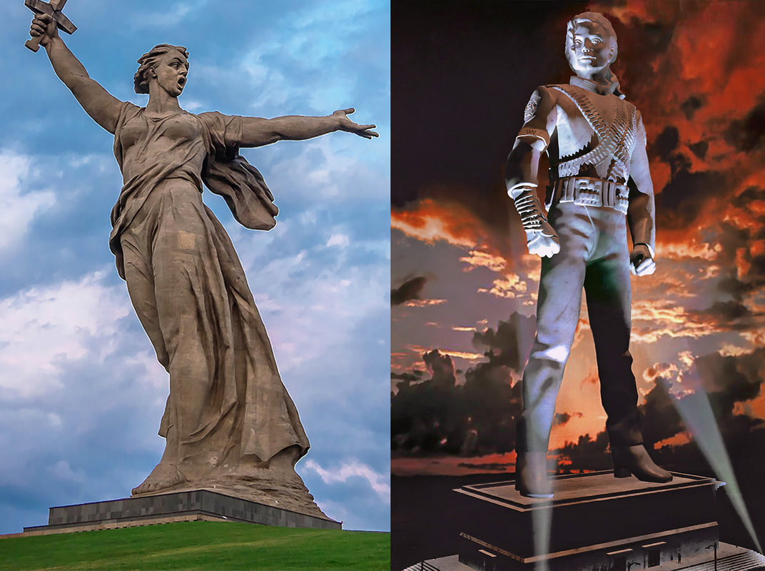 Figure 2 Michael wanted a marble statue that resembled Russia’s “The Motherland Calls,” created by Yevgeny Vuchetich in 1967. a marble white statue that resembled Russia’s 300-foot “The Motherland Calls,” a part of “The Heroes of the Battle of Stalingrad” memorial complex. The statue, found in Volgograd, Russia, commemorates the Battle of Stalingrad. It was designed by Yevgeny Vuchetich and structural engineer Nikolai Nikitin, and declared the largest statue in the world in 1967. “The Motherland Calls” is highly complex from an engineering point of view, due to its characteristic posture with a sword raised high in the right hand and the left hand extended in a calling gesture. The technology behind the hollow statue is based on a combination of pre-stressed concrete with wire ropes. The monument itself was inspired by the Ancient Greek sculpture, the “Winged Victory of Samothrace,” and was modelled on a local woman, Valentina Izotova. Two hundred steps, symbolizing the 200 days of the Battle of Stalingrad, lead from the bottom of the hill to the monument. The statue appears on both the flag and the coat of arms of Volgograd Oblast. Eventually, well-known illustrators and designers were summoned to start sketching what would be the future cover of the album. The result was dozens of designs that were put to Michael’s consideration. All the sketches were based on the costumes used by Michael in his 1993 Super Bowl Half-time appearance. One of these sketches was done by Drew Struzan, known for his illustrations of major Hollywood productions like E. T., Back to the Future, and Indiana Jones. 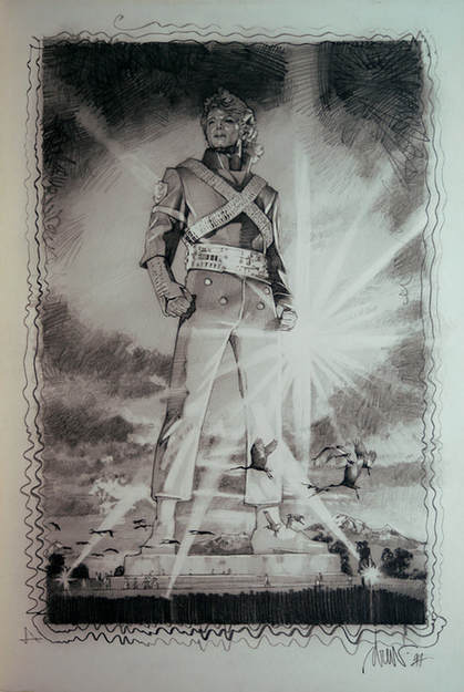 Figure 3 An initial sketch by Drew Struzan. 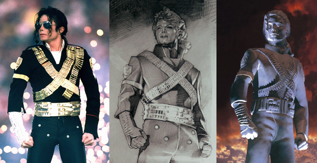 Figure 4 The evolution of the HIStory album cover from concept to completion. Several of the concept sketches were put to consideration by Nancy Donald, the Art Director at Sony Music. Michael approved the sketches and added his corrections and suggestions. Eventually, it was decided that the album cover would feature a statue rather than an illustration and Michael would hold a photo session that would express his desires. 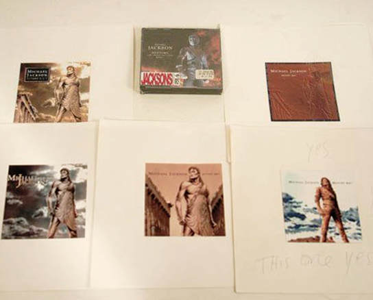 Figure 5 Several of the concept sketches were put to consideration by Nancy Donald. The company, Kleiser-Walczak Construction Co. was chosen by the art directors to realize this project. Diana Walczak would be in charge of modeling the statue in its first clay phase. With limited time, and Diana seven months pregnant, the photo session was scheduled for May 1994 in New York City. The idea was to capture Michael in his desired pose from different angles in order to have a comprehensive perspective that would serve as a basis for the sculpture. Although Michael was asked to pose without any make-up in order to properly translate the photos to a three-dimensional model, he spent half the time in wardrobe and arrived in full make-up. Walczak had barely a week to create the sculpture, with the help of two of her assistants. The final sculpture was roughly 1.2 meters high. After being approved by Michael himself, the clay sculpture was used to make a hard resin mold. During the process, the original clay sculpture was lost. The model obtained was then adorned with over four thousand lines that served to mark the topography of the model. This was then used to digitize the model and match the appropriate coordinates to the computer. It was decided that computer graphics technology would be used to create a high quality and realistic image. This would allow the designers to help fine-tune the light, textures, camera angles, and other details. Once the sculpture was digitized, engineers at Metrocom simulated bronze, platinum, and marble textures. Although on the final album cover only half of Michael’s body was shown, a stone pedestal was designed, along with flood lights that illuminated the statue. The background was comprised of dark clouds set against an evening red sky. 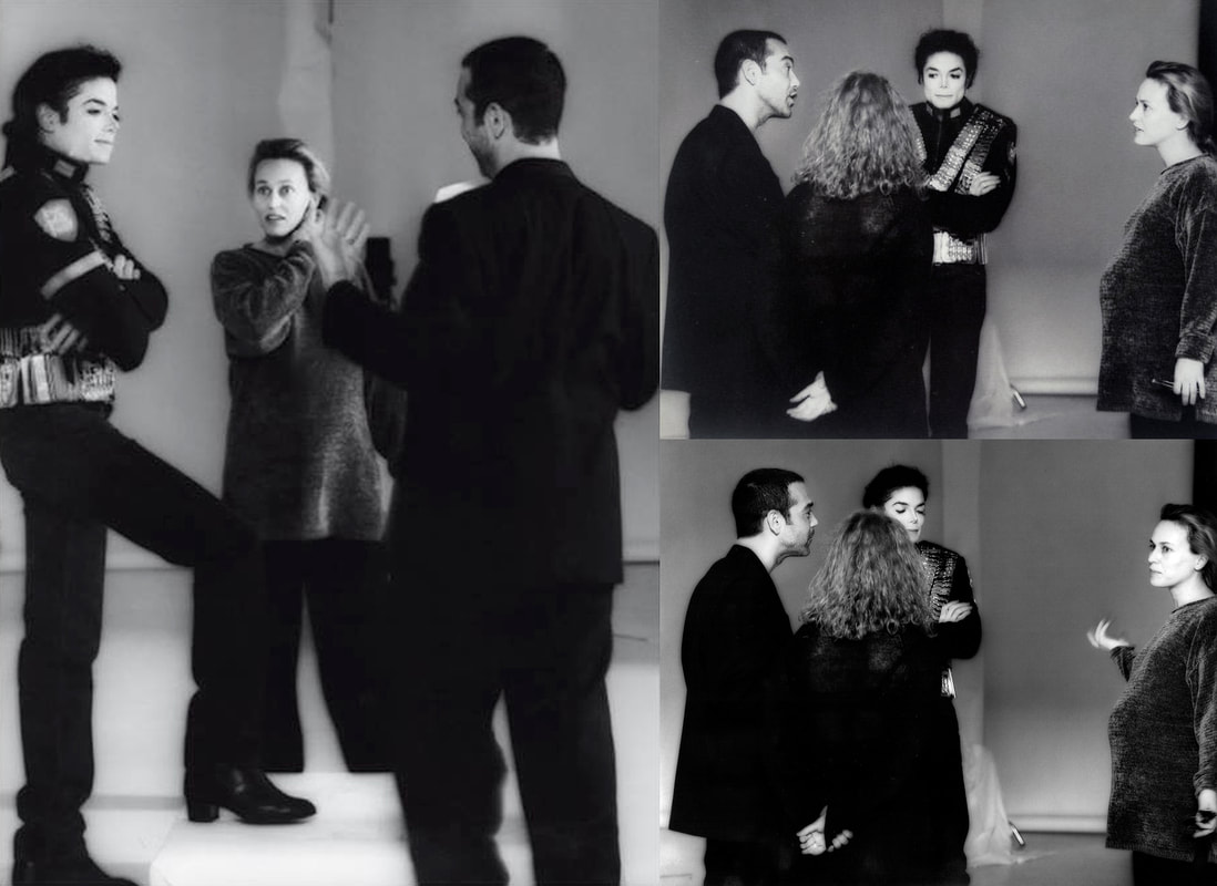 Figure 6 Michael discussing the concept with Diana Walczak in 1994. Figure 6 Michael discussing the concept with Diana Walczak in 1994. Diana Walczak shares her thoughts below on the creation of this remarkable work of art and what ultimately become a labor of love. The Making of a Monument: Diana Walczak In April 1994, I received a call from David Coleman, designer at Sony Music. He told me that for his new album, Michael Jackson wanted to appear like an immense marble statue, similar to the ones he had seen in Russia. David then had the idea to call us to help create a nice three-dimensional sculpture of Michael. Using 3D technology, he felt that Michael would be able to see the statue from different angles and try out different textures and lighting if he wanted to. Sony gave us a limited amount of time, so I laid out the plan and proposed a budget. To create the image, we needed to fine-tune the procedure, which would normally be used to generate an animated sculpture. It’s important to remember that in 1994 the computer technology that allowed us to create these types of models was quite limited. To create a 3D database, you had to start from a real sculpture and carefully encode each point and integrate it into a computer.  Figure 7 A head shot of Michael Jackson, in preparation for the sculpture. Figure 7 A head shot of Michael Jackson, in preparation for the sculpture. According to my work plan, I needed about a week to make the sculpture but the whole process would need atleast six weeks. To accelerate the process, I organized a photoshoot in New York in order to have a photographic reference to create a clay figure. I asked Michael not to wear make-up the day of the session, but he still ended up spending half an hour in the dressing room before coming out to meet us. I was surprised how kind, gracious, and cooperative he was. I took a few close-up shots of his face from different angles as well as full body shots. It was a great challenge to put it all together. To create the statue and cover of the album, I had to be sure that I captured Michael’s image in a positive light, for both himself and his fans around the world. 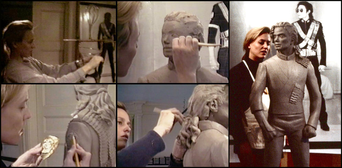 Figure 8 Diana Walczak crafting the initial wire frame and sculptural framework. 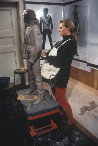 Figure 9 Walczak putting the finishing touches on Michael's sculpture. Figure 9 Walczak putting the finishing touches on Michael's sculpture. Meanwhile, I had to make sure to keep my artistic vision intact, which would allow me to create a dialogue between myself and the work. This way of working also allows me to obtain quite natural results without becoming too overloaded. I didn’t allow anyone into the studio while I was working as I didn’t want anything to distract me from being totally absorbed in my work. The only exceptions were my two assistants who made parts of the jacket in clay before placing them on the final sculpture. During the session, I had asked to have eight cameras with me in order to simultaneously capture the front, back, sides, and every angle of Michael. Unfortunately, on the day of the session, we only had four cameras and we had to reschedule another session with Michael to get the remaining angles that we couldn’t get that day. This time, the photos were printed at 1.20 m, the same size the sculpture was going to be. I wanted the photos and the sculpture to be the same height in order to easily compare and measure each part of the model I was creating. When the close detail was finished, I sent stills and videos of the original 48-inch sculpture to Sony and Michael, who provided his own notes. He was particularly critical of his face — he knew what a nasolabial fold was. He was also critical of his body — “Thighs too fat” was a note he left on one of the photos. 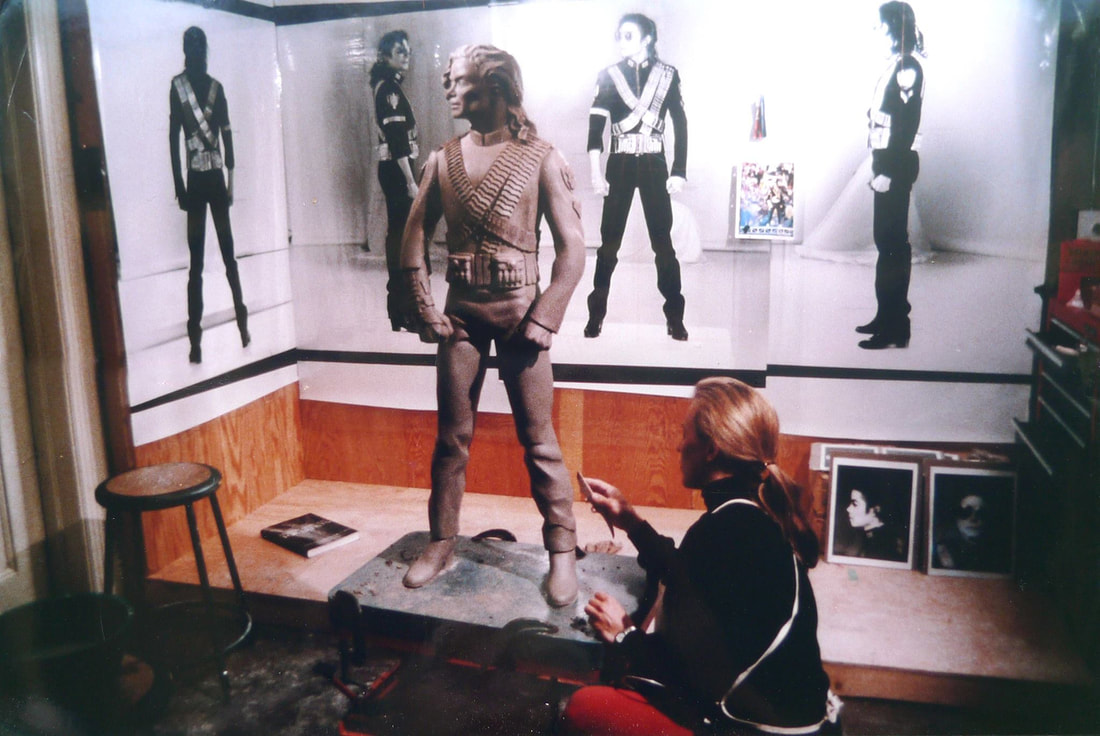 Figure 10 She wanted the photos and the sculpture to be the same height in order to easily compare measure each part of the model. 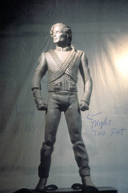 Figure 11 “Thighs too fat” was a note he left on one of the photos. Following a week of alterations, Sony gave me the green light to start the casting process, which morphs the water-based clay into the basis for a plaster-like silicone mold that becomes the permanent material. 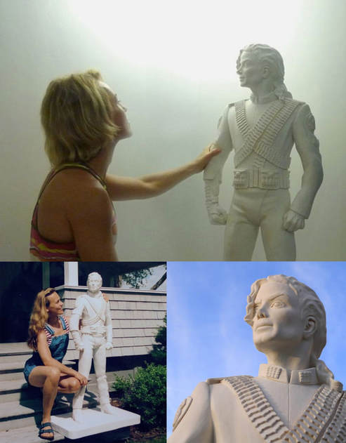 Figure 12 the casting process, which morphs the water-based clay into the basis for a plaster-like silicone mold. 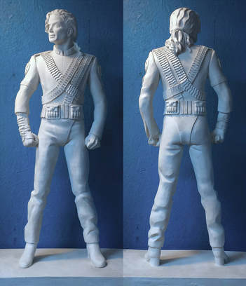 Figure 13 The final plaster mold of the sculpture. Figure 13 The final plaster mold of the sculpture. Then, using gridlines and a permanent marker, I added over 10,000 polygons to the hardened cast in preparation for the digitizing process, which took place in Los Angeles. This stage took two weeks longer than the creation of the actual clay sculpture. Our team then coded, one by one, each of the points at the intersection of the lines in order to create a digital version of the statue. Once this database was created, I was able to parameterize my computer using a program produced by Silicon Graphics Inc.
 Figure 16 A digitized version of the sculpture. I placed the virtual statue on a base that I had made. I put in several small figures to give the impression that there were people visiting this imaginary place to better accentuate the statue. I had a rather dramatic but flattering lighting; powerful yet smooth. As was my vision of Michael’s image: a superstar and a gentleman with whom I was fortunate to work. 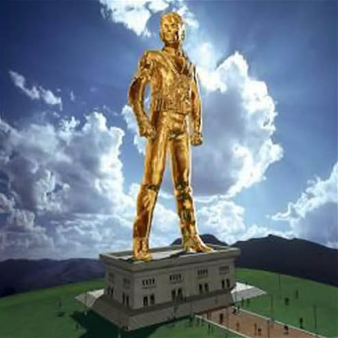 Figure 17 One version of the statue with a solid gold texture. Once the virtual figure was created, we tried different textures to cover it with. I first introduced the golden version to Sony. Both that version and the marble version were eventually used to illustrate the DVD covers for Michael’s short films. We also played around a bit with the animation and created a lively character. We made a neat little short in which you can see the sculpture jumping from its base before it started dancing. But for one reason or another, the executives at Sony weren’t that interested in this fun idea. 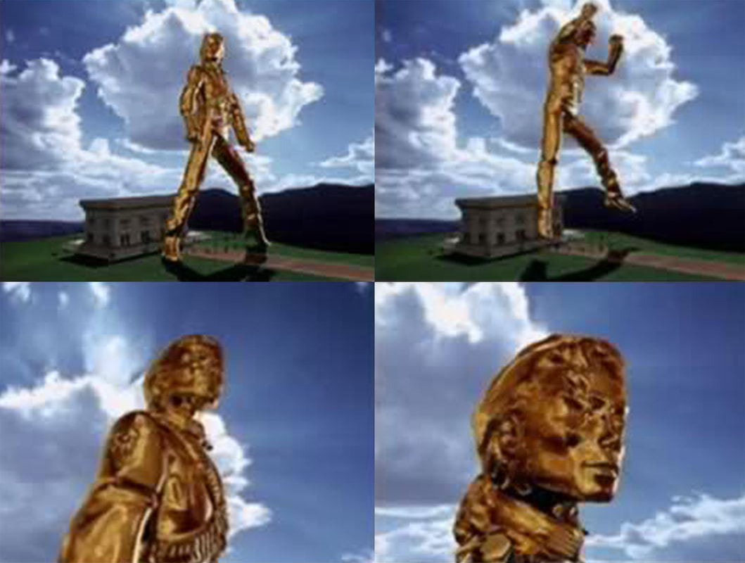 Figure 18 Walczak played around with different poses to stimulate new ideas. It was during the creation of the mold that I finally gave birth. My son, Jackson, was born on June 12, 1994. While he slept, I spent the time putting the finishing touches on the sculpture to prepare it for digitization. It was great working on such an amazing, fun, and stimulating project during my final months of pregnancy. It was a fabulous time. While working on the project, however, I could not imagine that this sculpture was going to become the basis for a worldwide promotional campaign of such magnitude. It took about eight months between the start of the project and the confirmation that this image was going to be used to illustrate the album. I jumped for joy when, in 1995, they announced that the statue was going to serve as the final cover for the album. I went to New York to admire this huge panel with the final result in Times Square. 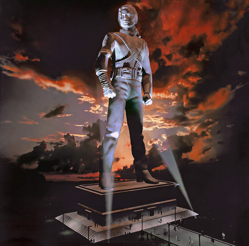 Figure 19 HIStory: Past, Present, and Future (1995). Living HIStory: Central to three of the songs on the HIStory album are the artworks which are featured in the accompanying booklet. The inspiration behind the artwork for “Scream” came from artist Gottfried Helnwein. Michael very much admired this artist’s work and had purchased some of his paintings. One of them, “The Song,” painted in 1981, inspired the artwork, along with Michael’s own childhood. Helnwein is considered quite provocative as he paints the human condition, depicting wounded children among other things – and Michael, being as sensitive as he was to the plight of abused, neglected, and deprived children and having been one himself, was apparently very touched by Helnwein’s work. 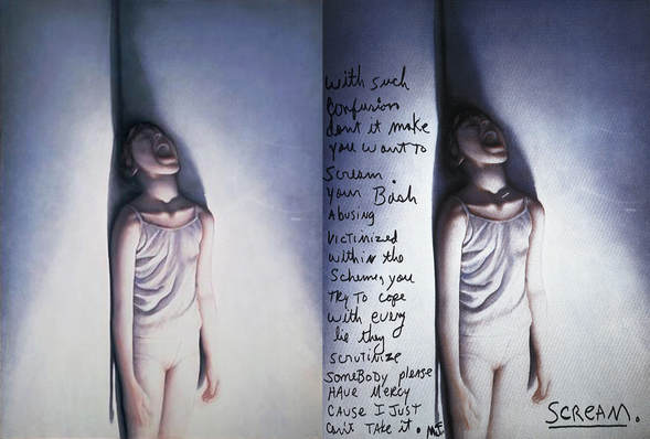 Figure 20 The inspiration behind the artwork for “Scream” came from Gottfried Helnwein’s, “The Song,” painted in 1981. Inspiring the artwork for “Little Susie” was Helnwein’s 1972 photograph titled “Child of Light.” The photo recreates a crime scene, in which an unidentified child’s body lays on a decaying wooden floor, a lone penny positioned beside her. The unconscious child’s head and eyes are heavily bandaged; her dress, seems new and unworn, and recently placed on her tiny frame; while light, seemingly from above, accentuates her wrists and closed eyes. 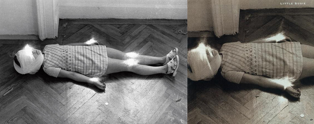 Figure 21 Inspiring the artwork for “Little Susie” was Helnwein’s 1972 photograph titled “Child of Light.” Thematically similar, is Michael’s own drawing of a sad and frightened child sitting in the corner of a room, crouching against a wall for protection. He is being pulled into an outside adult world by a microphone cord, and prematurely forced out of his childhood. This was included in the booklet that came with the HIStory album. 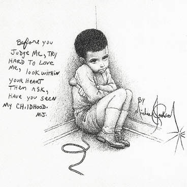 Figure 22 Michael Jackson's "Childhood." Both “Little Susie” and “Childhood” offer narratives in which the child protagonists are left to fend for themselves, as they are left disappointed and disillusioned, alone and isolated. “Little Susie” paints a grim image of a young girl named Susie, who was abandoned by her father, and left orphaned when her mother passed away. Susie drifts from family to family, abused and neglected, her pain and suffering ignored by the adults who were meant to protect her, and only come to Susie's aid upon her death. Susie's only comfort is the tune she sings to herself, which plays repeatedly on her musical box. The opening verse of “Little Susie” refers to a murder, however it can also be interpreted as the character of the narrative, committing suicide, her only escape from her tortured existence. Every Day Create Your HIStory Six singles were released from HIStory: “Scream”/ “Childhood,” “You Are Not Alone,” “Earth Song,” “This Time Around,” “They Don’t Care About Us,” and “Stranger in Moscow.” The album was well-received by music critics and was also commercially successful, debuting and peaking at number one in many countries around the world. 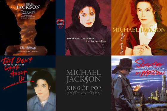 Figure 23 Six singles were released for the HIStory album.
6 Comments
|
AuthorMohammad Osman is an Artist, Writer, & Cultural Historian. ArchivesCategories |
- Home
-
Articles
-
Film
>
- Dark Side of the Screen: The Art of Film Noir
- Gothic Romance: The Art of the Macabre
- Perchance to Dream: The Art of Dark Deco
- The Road Goes Ever On: The Art of Middle-Earth
- There and Back Again: The Visual Poetry of Middle-earth
- King Kong: The Eighth Wonder of the World
- It's Alive: Universal Classic Monsters
- It Came from Beyond: Invasion of the Sci-Fi Films
- Creatures of Habit: Teenage Mutant Ninja Turtles
- Myth and Magic: The Art of Comic Book Films
- Arabian Nights: Sinbad's Adventures
- Music >
- Games >
- History >
-
Film
>
- Artwork
- Community
- About
- Contact

 RSS Feed